The Western Logo
Logos and Marks
All materials from the University should bear the logo and comply with the standards outlined in the Brand and Communication Guide.
Please review the following guidelines carefully before adding the logo to your project. After you have read through these guidelines, you may download the logo for use in print or on the web.
If you have any questions about logo usage, including when and where you should use the Western logo, reach out to University Marketing
Trademark Use
Western's names and trademarks are protected by State trademark law. The University names and marks may not be used to directly or indirectly imply the University’s endorsement, support, favor, association with, or opposition to an organization, product, or service without permission of the University.
External entities, including those in partnership with on-campus units, must obtain written consent from University Marketing
Institutional Logos

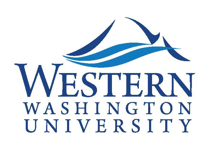
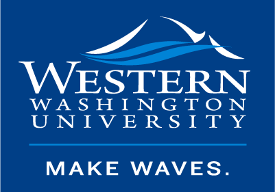
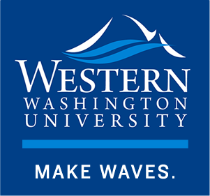
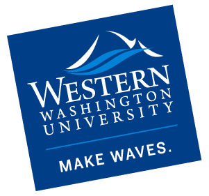
The Make Waves Lockup
The "stacked" Western logo, with the MAKE WAVES. lockup, is the institutional logo, and should receive primary consideration when making branding decisions.
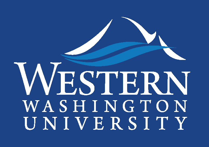
The logo is the simplest and most recognizable representation of our identity and consists of three parts:
- The graphic element, which is the stylized representation of Mount Baker and the waves of Bellingham Bay.
- The wordmark, which is the name of the university.
- The institutional tagline, "MAKE WAVES." This is our rallying cry, meant to inspire students, alumni, donors, and faculty to make their mark on the world.
The University Marks are registered trademarks and cannot be altered in any way. This includes separating out and using any graphic elements of the logo on their own or in combination with other graphic elements.
When to Use the Make Waves Lockup
The logo is not required for communication that is strictly internal. This includes communication between faculty, staff and students. For example, email about classes, memoranda, draft paper, and meeting notes do not need the logo. University Marketing must approve any other exceptions
Variants
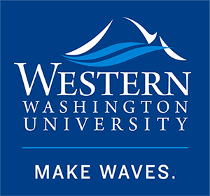
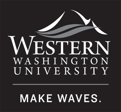
There are two variants for the Western logo–one for full color and one for greyscale.
Greyscale logos are for use in printed black-and-white publications such as newspapers. They are also used for internal documents that you know will be printed on black and white printers such as internal memos.
Full Color

Grayscale
Size and Space Requirement
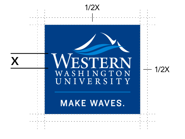
The minimum size for the Western logo is 1.25 inches, or 90 pixels, wide.
The clear space around the Western logo ensures the integrity and impact of the mark. This clear space should be equal to half the height of the capital “W” in Western.
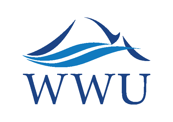
The Stacked Logo and the WWU Logo
There are situations where the Western logo will need to appear smaller than 1.25 inches or 90 pixels (i.e. specific digital uses like social branding spaces, lapel pins, small promotional items, etc.) due to readability. In these use-cases, the "stacked" and WWU variations of the logo are options. Grayscale options are also available upon request. If you’re not sure if it’s appropriate to use one of these variations, please connect with University Marketing.
The WWU Watermark
The horizontal, WWU watermark version of the logo is for specific space-restricted applications, such as pens and lanyards, where the wordmark of the other logo options is too small to read.
Use of the horizontal logo is by approval only, through University Marketing.


Social Media
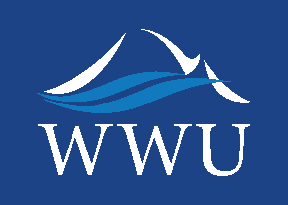
Western's main accounts are to use the WWU logo on the blue background. Other units who choose to maintain their own social media platforms are to use the WWU logo with a white background, as to differentiate sub-accounts from main accounts.
For more information and guidance on using social media on behalf of Western, read the social media guide.
Logo for Main Accounts
Logo for Sub Accounts

Sub-Branded Identity Marks

Sub-Branding Standards
The sub-branded identity marks are used to identify individual colleges, departments, officed, or other entities. To maintain the integrity of our brand, use only these sub-brands in your university communications.
These brand identity constructions are for outward-facing offices and units only. No other program, college, or department logos should be created or used.
Identity marks must be created and approved by University Marketing prior to use.
"Can my unit have a different logo?"
Under our brand standards, units, departments, programs, and offices may not have their own logos, apart from in exceptional circumstances in which the unit operates semi-independently of the University.
Having multiple individual identities throughout the university would lead to a devaluation and dilution of the overall Western identity.
Ensuring that all staff, students, colleges, and departments work under the single umbrella of the Western brand means that we can present a consistent image to our audiences. We all benefit from the reputation of and affiliation with the Western Washington University identity.
Distinct unit-level identities and differentiators are best highlighted in content and messaging. Contact University Marketing and we'll help you explore the best content strategies to help you your goals.
Campus Unit Mark
Western's offices and units, such as colleges and departments, have been authorized to use a unique identity mark construction (see below example using a fictitious department) to enable them to use Western's logo in their own brand identity.

Institute and Center Mark
Western's institutes and centers have been authorized to use a unique identity mark construction (see below example using a fictitious institute) to enable them to use a version of Western's logo in their own brand identity.
In this example, the blue dot to the left of the institute title is a placeholder for an illustrative mark that helps define the identity of the institute or center.

Size and Space Requirements for Sub-Branding
Identity marks for individual units can vary in width, so the guiding dimension for minimal size is the height of the mark. Minimum size for identity marks is 1.125 inches, or 80 pixels, high.
Other Logos and Marks

Other University Marks
The Western logo is often used with other official and affiliated university marks. All marks are trademarked and enforced through the State Office of Trademark Licensing. See Athletics and Associated Students for examples.
Using Logos and Marks

Do
- Use only the electronic logo and mark files provided by University Marketing.
- Follow the size and space requirements.
- Scale the files proportionally.
- Keep all elements of the mark together as a unit.
- Ensure the mark is sized to be readable.
- Use only university colors.
- Contact University Marketing with questions about the proper use of logos and marks.
Don't
- Try to recreate logos and marks.
- Add names or other type to the logos and marks.
- Stretch, squash or otherwise distort the logos and marks.
- Add or take away graphic elements.
- Make the logos and marks too small.
- Apply the logos and marks over busy patterns, backgrounds or colors that obscure readability.
- Change the colors, positioning, or orientation of the logos and marks.

Don't change the logo colors.
Don't distort the logo.
Don't add drop shadows, bevels, or other effects.
Don't change the positioning or size relationship of the logo.
Don't change the stroke width of the line rule.
Don't change the orientation of the logo.