Layout Builder
This tutorial will help you get started building pages with Layout Builder on Western's Drupal sites. Layout Builder is a powerful tool for building pages with an interactive, drag and drop interface. Layout Builder makes it easy for content editors to build interesting, responsive layouts.
Getting Started
How to Update an Existing Page
You will first need to be logged in via the /user page. For example, the following link would be used on this site is webtech.wwu.edu/user
Navigate to the page you'd like to update, and click on the Layout tab.
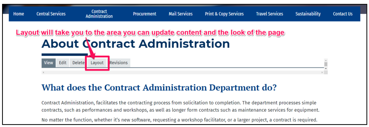
Once you are in the Layout, you will see the page broken up into sections and blocks, which are individually editable. On the right-hand side of each block is a pencil icon button representing the configuration options – click on this, then “Configure” to bring up its menu. This is where you will make your edits.
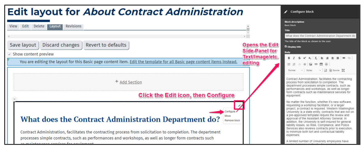
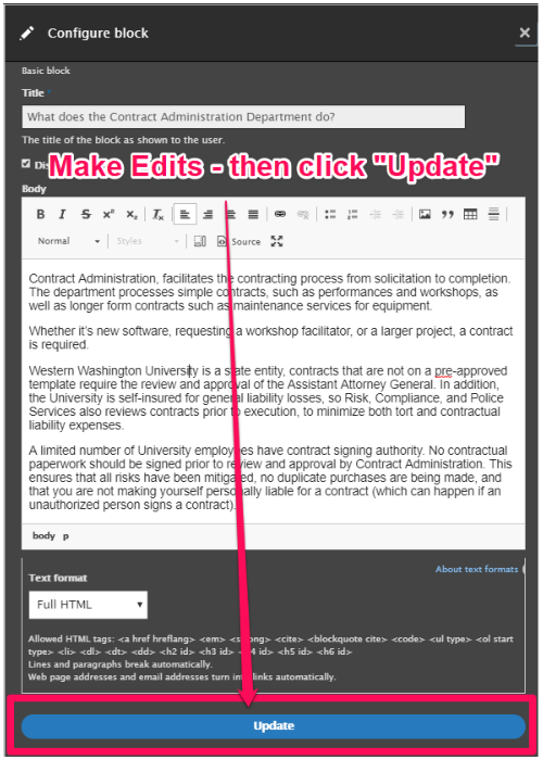
The body field of each block allow for you to edit content in a manner similar to a Word document. Once you have made your edits, scroll to the bottom of the right-side bar and click Update.
After you have finished updating your blocks, you will still need to save the page.
How to Create a New Page
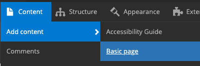
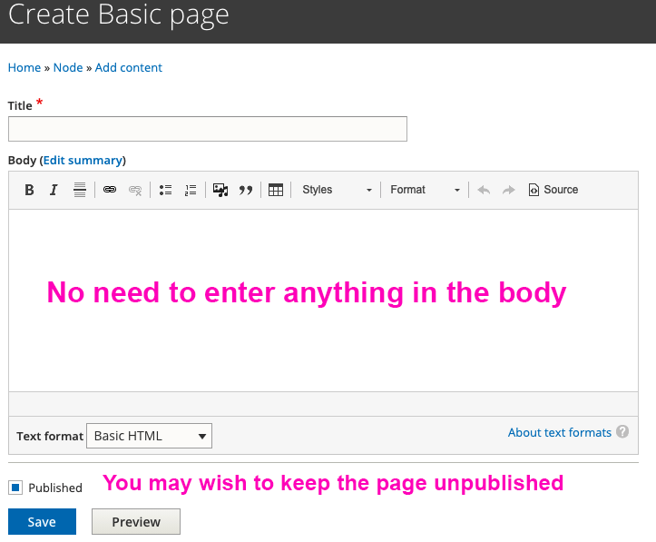
The first step to using Layout Builder is to create a Basic Page. Layout Builder can be enabled on any content type, but a Basic Page works most of the time. Create a new page by going to Content > Add Content > Basic Page
The page will need a Title, but leave the Body field blank. It may be a good idea to uncheck the Publish Content to keep the page unpublished while it is in a draft state. Click Save to create and load the page.
There will a be a set of tabs at the top edge of the page: View, Edit, Delete, Layout, Revisions.
Click the Layout tab to open up Layout Builder.

Missing the Layout Tab?
If you are a site super editor or administrator, you should be able to enable Layout Builder yourself. Go to Structure > Content Types > Basic Page > Manage Display, and check Use Layout Builder. After that, another checkbox should appear, Allow each content item to have its layout customized, which you should also check. Save these changes.
If you do not see the Structure > Content Types > Basic Page tree in your menu, contact your site's administrator or WebTech to have Layout Builder enabled.
Adding Blocks to a Page
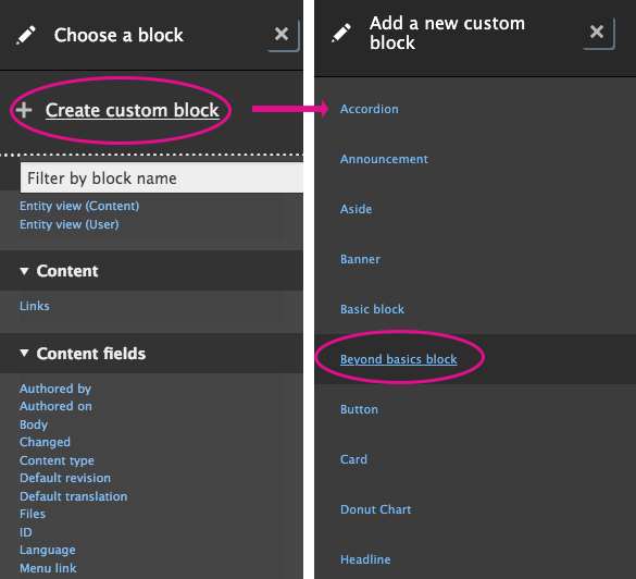
Whether updating an existing page or creating a new one, you will likely need to create new blocks. Locate the Add Block link, located at the end of each Section, highlighted in a light blue bar. This will allow you to create a new Custom Block. You can move the block around after you have created it, so it doesn't matter too much where it starts out.
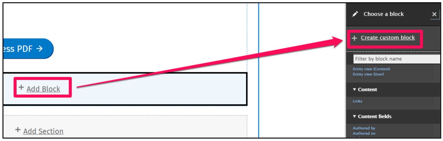
From there, you will choose Create Custom Block from the menu that appears on the right-hand side of the screen. This brings up all of the block types to choose from.
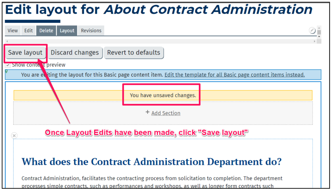
Saving a Page
When you are finished editing, scroll to the top of the page and click the Save Layout button.
Alternatively, you can discard the changes you've made.
Each time you save a layout, a revision is created. This allows you to revert to a previous version of a page.
Sections and Blocks
Sections
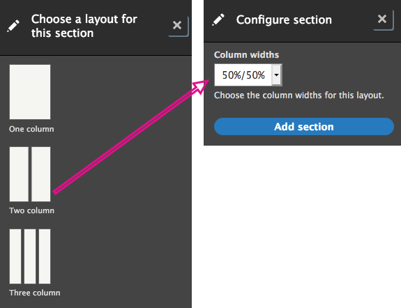
Sections create the layout structure, such as columns. Sections are what you can drag and drop blocks into. You cannot drag and drop sections themselves—you can only new create sections above or below existing sections.
You can also remove sections by clicking the small "X - Configure section" link at the top left of the section. (Sometimes the X does not render, and this displays as a vertical bar. Clicking on it will still bring up the same options.)
There are single column, flex, and multi-column layouts. Each multi-column layout has options for adjusting the width of the columns. These options will show up after selecting one of the layouts.
Blocks
Blocks contain a page's content.
There are many different types of blocks. Some of these make use of some of the most powerful features of Drupal as a content management system. There are also some simplified custom block types built by WebTech. These are the block types that are covered in this tutorial. These custom blocks are pre-styled, have a variety of customization options, and are mobile friendly.
To add one of these blocks, select Create a Custom Block and choose one from the list.
Start with Beyond basics block. It offers a lot of customization options for flexibility, and is useful for basic text content.
Understanding Fields
Fields are the text inputs and select options that control the output of a block.
In a Beyond Basics block, the available fields are:
- Title
- Heading font
- Heading level
- Body*
- Background color
- Font size
- Custom classes
* Note: There is also a Text Format select menu below the Body field, but this is not technically a field. Rather, it's an option attached to all large text fields.
For the most part, text boxes will control content in a block. Drop down menus will affect the look or styles of the block.
For Beyond Basics Blocks, the Title field affects the heading of the block. The two heading select boxes affect how the title looks.
Background color changes the block's color, and also the text and link colors of the block. Font size changes how big the font is on that block.
Custom classes is a special field. It does not output any text. Rather, it injects CSS classes onto the blocks' container. This is an advanced use that is not covered here, but some examples of available classes can be found in the Blocks Examples.
