Content is viewable in both landscape and portrait mode
Applicable Role(s): Designer, Developer
Overview
Users may view digital content on a range of devices and contexts, which may mean changing the orientation of the device. Some users may also need to fix their device to a certain orientation for better accessibility.
Best Practices
- Ensure content isn't restricted to any orientation, and is viewable in both portrait and landscape modes
- The exception is if an orientation is essential to the content's meaning. Example: rendering a piano playing application in landscape only is considered essential, as the experience can't be conveyed the same in portrait mode.
- Use responsive design best practices so content is viewable at a range of device widths.
Pattern Examples
Accessible Example: University Homepage Site
The homepage site rotates between portrait and landscape mode, and is still viewable:
Portrait
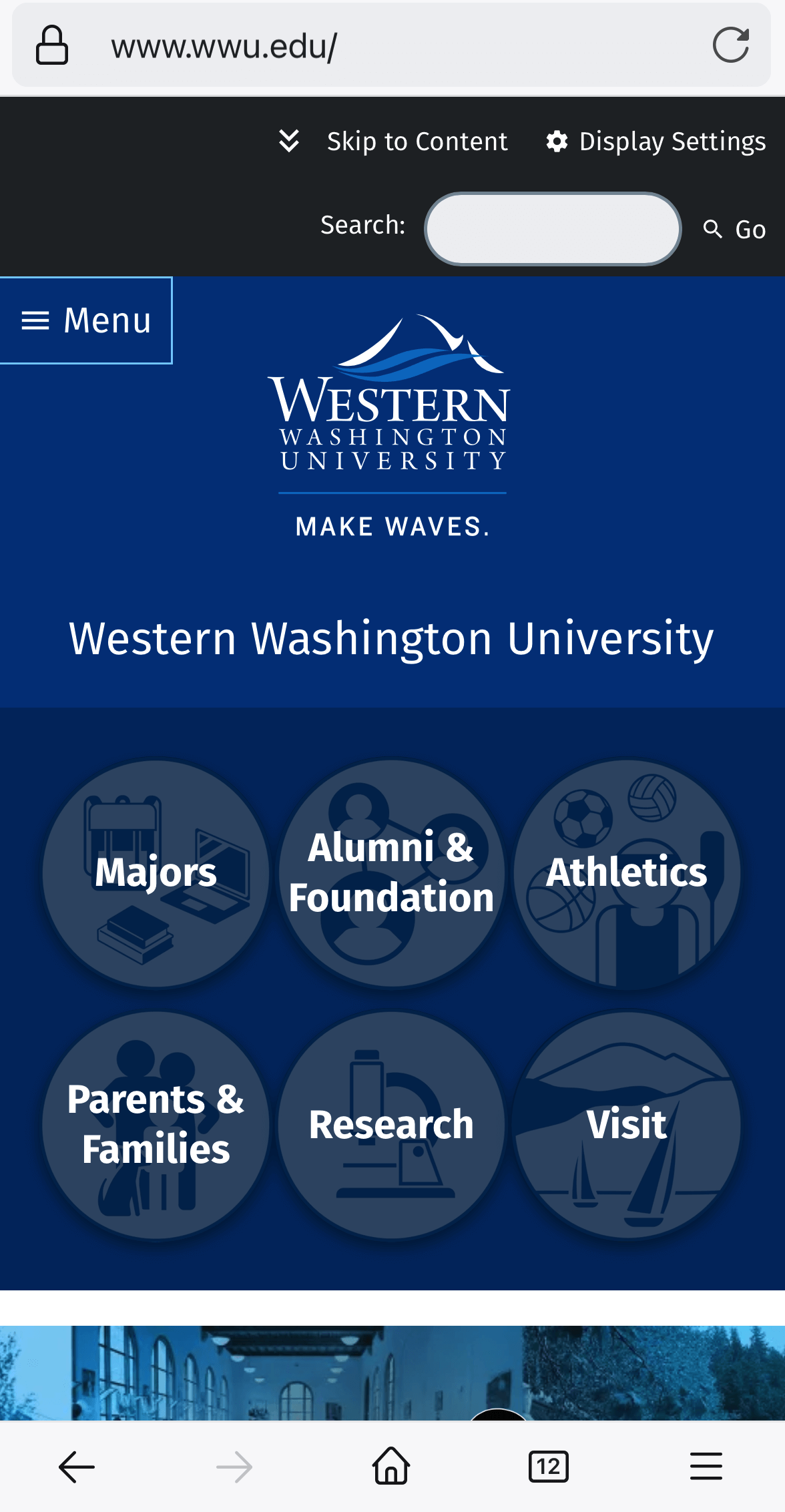
Landscape

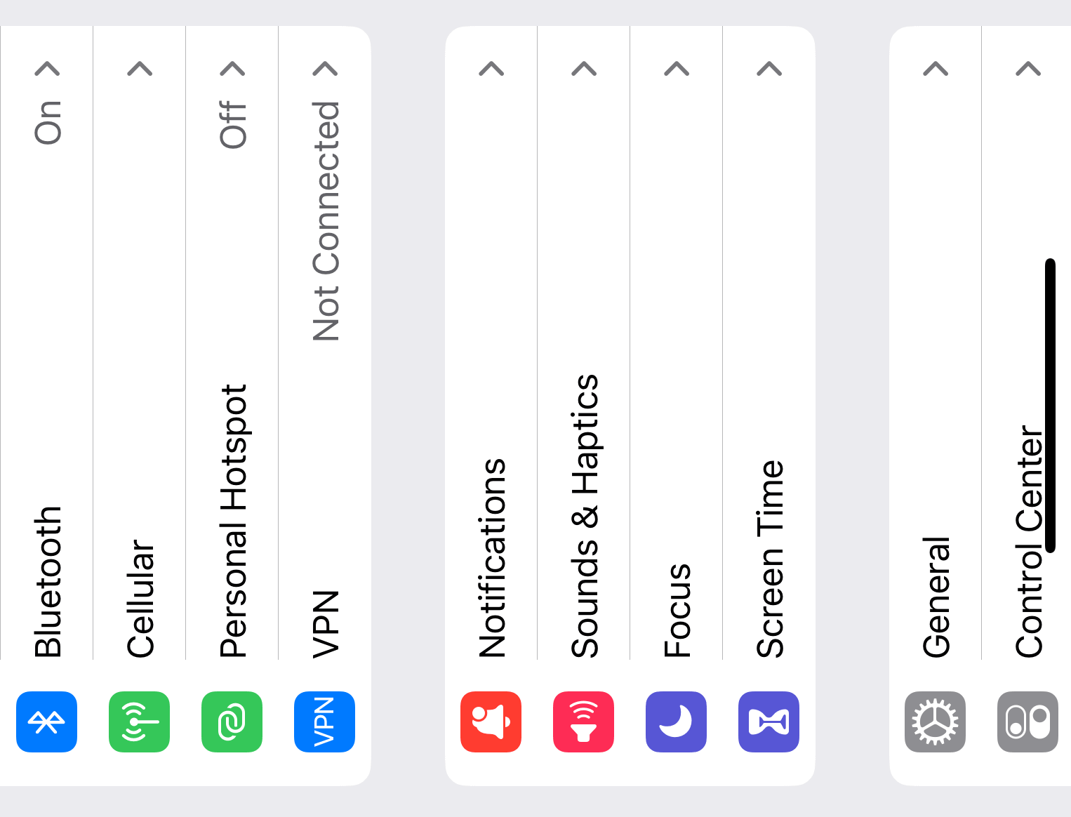
Inaccessible Example: iOS Settings
If someone wants to view their device horizontally and adjust settings on their device, the menu doesn't rotate to reflect landscape mode. This makes the menu render sideways, and much harder to scroll through and use.
Portrait
Landscape